Design Shanice

Design Shanice

Inspirations?

I wanted to leave a post about my inspirations and the artists behind all my work, firstly when I was re discovering typography I already knew some artists that I love and find there work extremely fascinating.

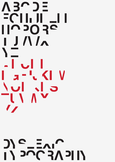
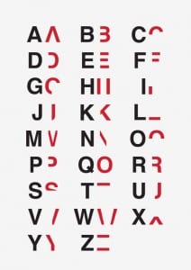
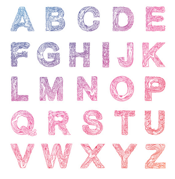
Firstly we have the amazing Ivan Filipov his work is just incredible. I find that it is always so simplistic but has such an impact from what is on the page. One of the first pieces of work I saw of him was “Tricolore Vector Typeface”, the fact I have never thought that several different colours would work with a font and still be able to read what the letter is

really just looks amazing.

You can see from the picture here on the left hand side that the colours are not even like they are similar so he used them that way, he actually uses different types such as poka dots. This typography really stands out for me and Ivan really inspired me to be able to create anything.

david


large
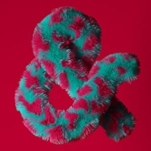
Another artist is David Mcleod is an Australian multi disciplinary illustrator and artist, he work is not only inspiring but its beautiful.

His website is very interactive and professional, http://davidmcleod.com here is the link, one piece of work I like is the “Amfursands” this is the “&” he has recreated it but made them furry and with different types of fur.

All of his work is so simplistic which is what I love because he thinks outside the box. Like how we all would think
of rope when mentioning sailors but don’t ever physically imagine rope typography like he does.


Ivan and David were the two previous typography I already knew about and loved, but after looking at typography again as I mentioned I found artists such as; Chris Labrooy, Thuy Mat Tit and Tomasz Biernat.

I love Thuy Mat Tit’s “Whispered Garden” work, its truly remarkable, the letters are so minimal but it is containing so much detail inside. You can clearly see the hours and effort that were put into the font. The best letter for me is “Q” the way it just flows on the page the tiny women hiding behind the ivy and flowers and the way that the end of the Q just falls down like Ivy would normally do, just small pieces of detail such as this is so important which is why I love it.


Idea 2!

So as I mentioned before I had a different idea that I will be doing the whole alphabet, my idea basically is sign language. You may see that there is a pattern with braille and sign language but I feel that they both have not been done and are something a little different to work with and challenge myself with.

After doing some research I found that hands and typography were very limited and rather boring, I’m going to have the letter rather bold and a hand showing sign language which I hope to photograph someones hand whether its my own or a friends, who will be doing the letter in sign language and place it inside the letter. So for example have the letter A the a hand singing “A”, I found that I was looking at hands doing letter shapes like when I was a young adult doing the word LOVE with my hand and with my friends for shadows. This gave me an idea that the hand in the letter would look better drawn.

I think that taking the picture and then putting it in illustrator then trying to draw round the main areas of a hand would look better than a picture in the letter as it would fit in and not stand out as much as a picture.

I created a moodpboard of some pictures I found and got inspiration from,

(Please click on the picture to see bigger and clearly)

moodboard

I felt that the font needed to be really bold, to the point it does not have any hole inside any letter such as “O”. This is so that the hand can fit in the letter and maybe even cover part of the letter but so you can still make out what letter it is. The picture in the bottom left corner with the hand and flour I really liked and may try taking a picture with a letter instead of the hand just to see what it looks like, I may not use it but just would like to experiment with flour to see how it looks.

I was looking on dafont.com for different styles and came across the font blackout sunrise I likes this font at first but found that when trying to place the hands on top of the letters they were to big for it and wanted a different and more bold font. I was looking online again and found Wagner Silhouette font, this font is perfect the letters are big and bold also don’t have any holes inside the letters which is a bonus. The best thing about the font is that the letters are not boring and have a little twist like the “C” looks a little like pacman so makes it that little bit more interesting.

In my workshop I had a little play around and came up with this;

Screen Shot 2015-10-20 at 20.11.40


this is only half done because I never managed to finish the rough in the workshop, but you can see I took some hand signals from a picture of google and just roughly cut around them and placed them on the letters. I done this to have a play about and see where they would look best on the letter, some things will need to changed like for example on the letter “Y” I got a paint brush and made it have an arm so that the hand fits at the top. Some other parts I had a move about with was the letter “V” i cut part of the hand of and like some others I placed it sideways so its not all the same and at the bottom.

Ive still got more to do yet but I’m more confident about this typography and am looking forward to the end result.

4D Typography?

I found something online to do with 4D typography and I had the idea that maybe trying to create a big letter that was 4D but my typography by using the braille concept along with it.

So I took this in to account and when I had some time in my workshop I printed of some A’s and started to look out how I would create it, I made a small version but would like to make a really big one.

This is what I created….

IMG_4421

IMG_4423

IMG_4422


After I made this little one I soon realised that I would need to make the letters really bold so that the lines would be able to connect and hold together. The font Im using anyway is pretty bold so hopefully it should work, I don’t really see why it wouldn’t but I would like to maybe keep trying and get bigger each time.


Workshop 3

Hello!

I had my third workshop and because I missed the previous workshop I felt a little behind with what we was doing in the lesson. But I felt like I had been looking at a few ideas before in the last week of what to do for my project. I did not feel as behind when doing some work.

My main idea at the moment is to work with “braille” and typography, my idea in a nut shell is have a bold type of font and physically add the braille in to the font its self so that blind people can learn what a “B” is with the braille and actually feel the letter of the shape, I feel that this would give them a better understanding of letters and numbers.

I started to look a little more in depth with braille and the history, I needed to know more so that I don’t just make the dots any size because this may actually not work and could cause an issue.

IMG_4410


Research!

Braille is a system of touch reading and writing used by a blind person. Embossed dots must be easily discernible to touch and the height of the dots must be sufficient to be easily distinguished from the background.

  1. The nominal height of braille dots shall be 0.019 inches [0.48 mm] and the normal base diameter of braille dots shall be 0.057 inches [1.44 mm]

As you can see from my picture above these we’re my ideas and the final one I picked was the braille one, but I did come up with a back idea. The reason I thought to have a back up idea was not because I don’t believe my main idea won’t work or be good, the only negative about it is blind people may not actually be able to read the braille and understand the letters to what they are used to. But I have taken this in to account and my first thought was to have the braille all over the letter like for example, the letter B the braille for b is two dots one above another. I was going to put all the braille in every bottom left hand corner of the letter. The second idea I had was to not have it so big but actually do it the normal size of 0.48 mm and keep it simple like the original braille and not to complicate things more than it already is.

My plan b is do something along the lines of dyslexia and typography, I though as I have a brief understanding being dyslexic myself I could learn more about it for myself and see it works with me and other people. So from this I researched a little more and below are some pictures, I find the left one simply incredible the fact you can have any word messed up and still be able to understand and read it. Just simply have the same letter at the start and end, the middle can be mixed up and it still makes sense. For someone with dyslexia and who struggles to spell it makes sense that you can still read it as the right spelling and word but for anyone else it could be completely wrong.

Dyslexia is estimated to affect 10 percent of the worlds population, Dan Britton was in his third year at university when he was diagnosed with dyslexia and he wanted to create a typeface to try and get across to others how infuriating it is to try and read something so simple. The picture below was what he started to create, he took out 40 per cent of each letter and number to remove their key characteristics but wanting to leave enough so they are still just about legible.

Dyslexia typography by Daniel Britton

IDyslexia-typography-by-Daniel-Britton_dezeen_468_7

1


I feel that I may need to look at maybe getting some more information on dyslexia but this is my back up plan and I think it will also help me with words anyway.

Thanks for reading!

Shanice

Typography!

Hello!!

So this week in my workshop we had a look again at typography, in my first year we had a brief look at typography and when I was told in my workshop the first area we was doing was typography i was rather happy. Last year I enjoyed it but felt that it never actually progressed any further than searching online at different fonts and finding different typo in books, where as in the workshop we got to do something physical!

We was put in groups and told to go find different typography by taking pictures and coming back to the class to make a collage type of picture which seemed exciting.

After the lesson I felt like I should look more into typography again to refresh my mind from last year so I went by the library on my way home and grabbed a few books.

After reading through a few of the books it really helped me with understanding more about typography its self and not just kerning and how ugly comic sans is. Ive learnt more about the technical side of how interesting typography actually is.


FullSizeRender

Although reading this seemed like a simple thing that I should already know but its actually rather important. The wheel of colours is conceivable to consist of an infinite number of variations, too subtle for the human eye to discern. The black in the middle of all the colours is mixing together all of the surrounding colours, the black is in fact the root of all the colours. It brings harmony and emotion. – “Colour & Type, Rob Carter”.

Still on the subject with colours and font, colour with font can make a huge difference when trying to express something through words. Such as; red, orange and yellow are colours that suggest warmth. Colours appear hotter as yell decreases and as red increases. When creating something like a poster or leaflet and wanting to put across sad and water a poster would use the colour blue. Meaning blue for water and for the emotion of sadness.

Typography with packaging is key for looking perfect for the shelf, it has to have all the information information about all the ingredients and proper use but the main selling point is the typography on the packaging piece its self. The overall look on the package needs to explain everything about the product but not to create a whole book about it. Simplistic is the key, the colour and typography needs to help the product sell by being bold and creative. Making the product shocking or amazing is a classic rule, because if the product does not seem to have either it will be forgotten in seconds.

Some examples of amazing typography & packaging:

0bebdee899edfb4faf9bc308e391c52bbe8b68e7f6c8f7f539ab291803cdc6c4ec7fcd63692c6aea299e4011579b3ad7fe8892762773a5c5e936f526a0d1af74

I find these all so simple yet clever, the amazing drawing on the Kraken bottle making it look vintage but still modern, the sandwich has only a few words and is bold but gets the main information across which is enough for a sandwich box. I really like the creative look on the meat boxes, the fact you can see what the meat looks like along with the actual cow or pig on it. This can also make a shopping trip for children fun, to be able to help there parents shop and learn by looking for the cow on the packaging.

Well thats all for today and Im sure I will be back soon!

Thanks again, Shanice!!