Braille Complete?


Feel free to click on the images to see a better version, but after a long time working with it I feel that this is my final braille alphabet typography.

This may not look like a lot but when used in the right places this could make a huge impact on peoples lives.

Screen Shot 2015-10-21 at 00.15.45 Screen Shot 2015-10-21 at 00.41.41 Screen Shot 2015-10-21 at 00.41.54


BrailleCD

Inspirations?

I wanted to leave a post about my inspirations and the artists behind all my work, firstly when I was re discovering typography I already knew some artists that I love and find there work extremely fascinating.

Firstly we have the amazing Ivan Filipov his work is just incredible. I find that it is always so simplistic but has such an impact from what is on the page. One of the first pieces of work I saw of him was “Tricolore Vector Typeface”, the fact I have never thought that several different colours would work with a font and still be able to read what the letter is

really just looks amazing.

You can see from the picture here on the left hand side that the colours are not even like they are similar so he used them that way, he actually uses different types such as poka dots. This typography really stands out for me and Ivan really inspired me to be able to create anything.

david


largeAnother artist is David Mcleod is an Australian multi disciplinary illustrator and artist, he work is not only inspiring but its beautiful.

His website is very interactive and professional, http://davidmcleod.com here is the link, one piece of work I like is the “Amfursands” this is the “&” he has recreated it but made them furry and with different types of fur.

All of his work is so simplistic which is what I love because he thinks outside the box. Like how we all would think
of rope when mentioning sailors but don’t ever physically imagine rope typography like he does.


Ivan and David were the two previous typography I already knew about and loved, but after looking at typography again as I mentioned I found artists such as; Chris Labrooy, Thuy Mat Tit and Tomasz Biernat.

I love Thuy Mat Tit’s “Whispered Garden” work, its truly remarkable, the letters are so minimal but it is containing so much detail inside. You can clearly see the hours and effort that were put into the font. The best letter for me is “Q” the way it just flows on the page the tiny women hiding behind the ivy and flowers and the way that the end of the Q just falls down like Ivy would normally do, just small pieces of detail such as this is so important which is why I love it.


Finishing rough and photographs!

So after my workshop I went home and finished my rough version of how I would like it to look roughly….

(click to see larger and clearly)

Screen Shot 2015-10-20 at 20.39.35


For my photographs I obviously researched how to do alphabet sign language to use for my final typography, some letters were easy to photograph and some were rather difficult to take a picture and do the hand sign. In the end I had to ask my friend to use her hand so I could make sure the camera was in the right place and her hand looked good enough for me to use.


Idea 2!

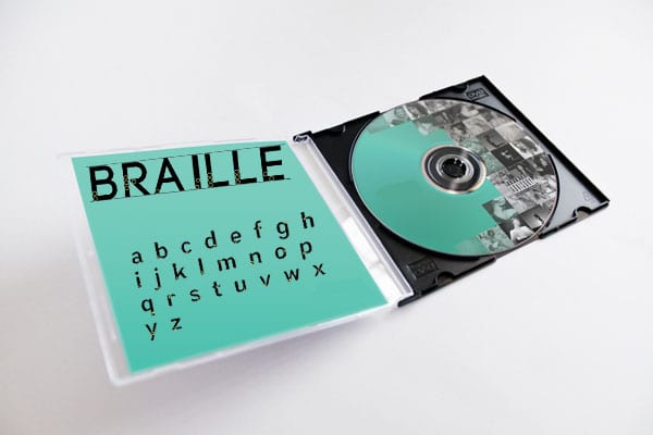
So as I mentioned before I had a different idea that I will be doing the whole alphabet, my idea basically is sign language. You may see that there is a pattern with braille and sign language but I feel that they both have not been done and are something a little different to work with and challenge myself with.

After doing some research I found that hands and typography were very limited and rather boring, I’m going to have the letter rather bold and a hand showing sign language which I hope to photograph someones hand whether its my own or a friends, who will be doing the letter in sign language and place it inside the letter. So for example have the letter A the a hand singing “A”, I found that I was looking at hands doing letter shapes like when I was a young adult doing the word LOVE with my hand and with my friends for shadows. This gave me an idea that the hand in the letter would look better drawn.

I think that taking the picture and then putting it in illustrator then trying to draw round the main areas of a hand would look better than a picture in the letter as it would fit in and not stand out as much as a picture.

I created a moodpboard of some pictures I found and got inspiration from,

(Please click on the picture to see bigger and clearly)

moodboard

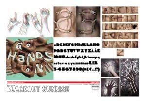
I felt that the font needed to be really bold, to the point it does not have any hole inside any letter such as “O”. This is so that the hand can fit in the letter and maybe even cover part of the letter but so you can still make out what letter it is. The picture in the bottom left corner with the hand and flour I really liked and may try taking a picture with a letter instead of the hand just to see what it looks like, I may not use it but just would like to experiment with flour to see how it looks.

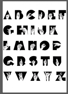
I was looking on dafont.com for different styles and came across the font blackout sunrise I likes this font at first but found that when trying to place the hands on top of the letters they were to big for it and wanted a different and more bold font. I was looking online again and found Wagner Silhouette font, this font is perfect the letters are big and bold also don’t have any holes inside the letters which is a bonus. The best thing about the font is that the letters are not boring and have a little twist like the “C” looks a little like pacman so makes it that little bit more interesting.

In my workshop I had a little play around and came up with this;

Screen Shot 2015-10-20 at 20.11.40


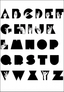
this is only half done because I never managed to finish the rough in the workshop, but you can see I took some hand signals from a picture of google and just roughly cut around them and placed them on the letters. I done this to have a play about and see where they would look best on the letter, some things will need to changed like for example on the letter “Y” I got a paint brush and made it have an arm so that the hand fits at the top. Some other parts I had a move about with was the letter “V” i cut part of the hand of and like some others I placed it sideways so its not all the same and at the bottom.

Ive still got more to do yet but I’m more confident about this typography and am looking forward to the end result.

Panic!

So basically after I was reading through the module guide I started to feel like I was doing the wrong thing with my work. I always had a different idea on my mind but never thought to note it down on my blog or to look into it any further, after going to my workshop and not realising we had to present our work I started to panic even more as I had nothing prepared or ready to show.

So from this I told my teacher and which he was fine with and I just listened to everyone else and learnt about how they handle the work with them explaining there idea and process of it all. Some people are using the idea of dead body parts, another is hair from there hair brush and many other different ideas. I started to take some note from what everyone presented and thought it would be a good idea to actually start creating my other idea instead of the one I was doing.

Although this may be a bad idea as I’m leaving it a little late but when I was in the lesson researching a little more about it, my teacher was asking if I needed any help and I wanted to explain my issue. But it actually helped me because he said that my idea was right and was fine I just did not have confidence in it, so I feel like even though I’m about to put more work on myself. Im going to carry on with the Braille and only do the letters; A,B,E,I,L,R to spell out the word BRAILLE, but I’m also going to do the whole alphabet with my other idea.