

Idea 2


Idea 2
I have been working on the second project and realised that I wanted to completely finish my typography work so went back to it and started to redo the hands.
I print screened how I did it this time, I had a little problem last time because when cutting out the back ground I took the easy root of using the “Magic Want Tool”. Where as this time I used the pen tool and pointed the parts of the hand singly then used the path tool which cut the background out. Then I edited the hand its self and made sure it was plain and had no wristbands or tattoos, this was the same as I did it last time, then this time to change the colour I simply just used black and white the automatic version and then saved it as a png so it was still transparent.


The second part of how I put the image on to the actual letters, at first I soon realised the letters were still a font and I had to change the font to an outline. That way I was able to have the image inside of the letter which will look professional and what I would like it look like.
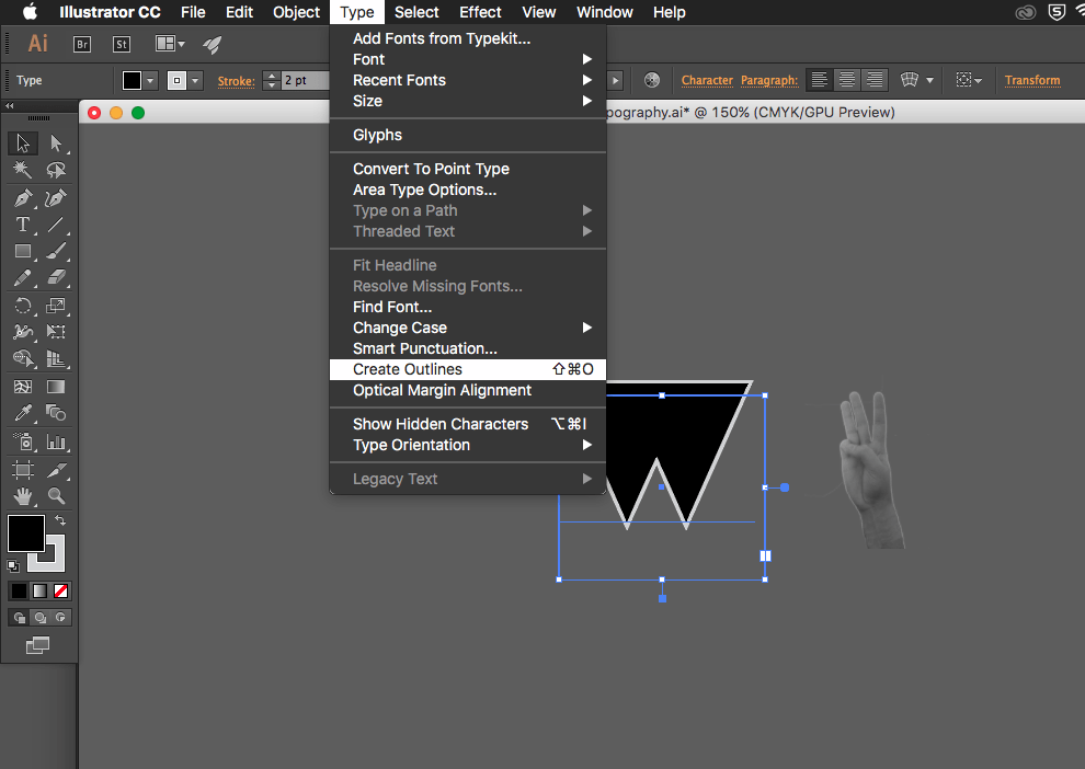

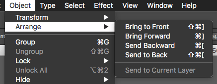

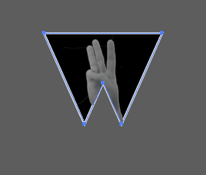
In more detail to the pictures, firstly like I mentioned I had to make the font an outline, then duplicate the font. I copied the letter then paste in place so it was perfectly inline with the other letter, I then had to make sure the image was in the right place where I would like it to be in the letter. After making sure it was in the correct place, I arranged the image to be at the back of everything and held down cmd and clicked on one of the letters. That way I could then right click and “Make Clipping Mask”, which gave me my final result of my sign language typography.
So I have been having a little trouble with trying to find the best way to make my pictures look like a drawing of the sign language alphabet. I firstly took the pictures which are not the best quality, I did think about taking them again but then came to the conclusion that the images will be very small and you wouldn’t even notice the little detail on them.
After playing around on photoshop, I made a few letters different using a different technique of black and white and desaturate. I wanted to make it look like I had a drawn hand but felt it was to hard for me so finally found a better and easy way to create a drawn like look.

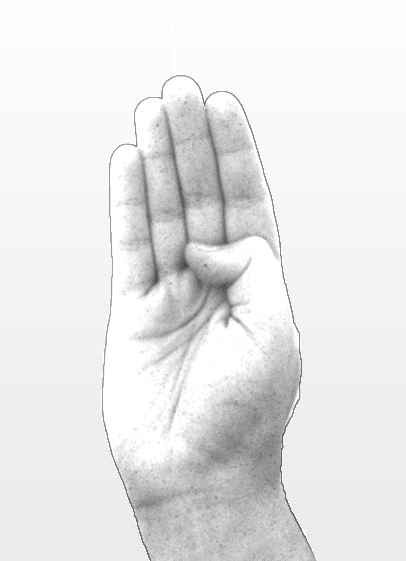

These letters are A, B and C, I prefer letter B I feel like it looks more drawn than the other two. A looks really odd the outline is standing out to much to the rest of hand, C is just black and white but look to dark to go on the black font, so the best thing to do is the letters like B.
How did I do it?
Firstly, opened the file and made sure I took the pad lock off. Any editing that was needed like in the pictures I had taken there was a tattoo and wristbands on so they needed to be edited out. Once they were done I duplicated the layer and went to adjustments then Desaturate, this makes the image black and white and removes as much colour as possible. I then duplicated one of the layers again but this time the newest duplicate I inverted, then the inverted layer was changed from normal to colour dodge. Once doing this the layer fills with white the image is still there but just nee to add an effect to make it have a sketch look. To do this I go to filter and Gaussian Blur which then opens up a box and gives me the option to adjust the sketch effect to add more if need be or less.
Now this has been made into a sketch type look I then just need to cut the extra edges that are not needed so they fit perfectly in the font.
This is the before
and this is the after

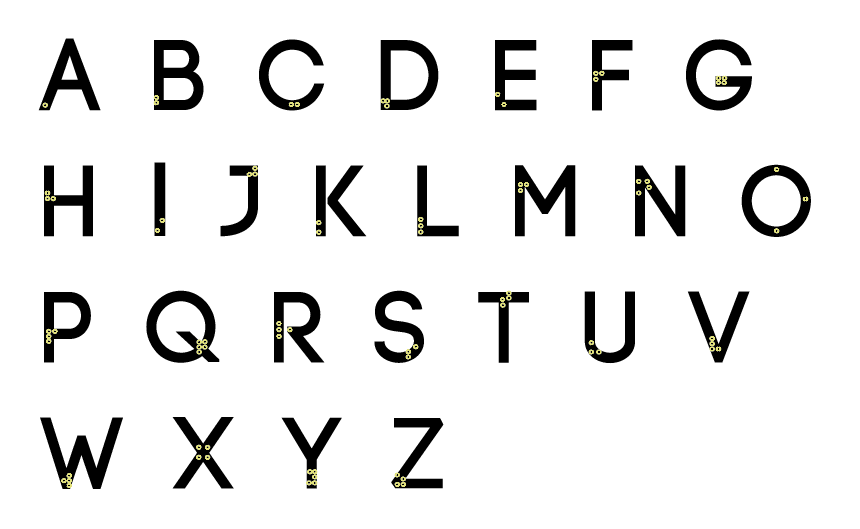
Feel free to click on the images to see a better version, but after a long time working with it I feel that this is my final braille alphabet typography.
This may not look like a lot but when used in the right places this could make a huge impact on peoples lives.


So basically after I was reading through the module guide I started to feel like I was doing the wrong thing with my work. I always had a different idea on my mind but never thought to note it down on my blog or to look into it any further, after going to my workshop and not realising we had to present our work I started to panic even more as I had nothing prepared or ready to show.
So from this I told my teacher and which he was fine with and I just listened to everyone else and learnt about how they handle the work with them explaining there idea and process of it all. Some people are using the idea of dead body parts, another is hair from there hair brush and many other different ideas. I started to take some note from what everyone presented and thought it would be a good idea to actually start creating my other idea instead of the one I was doing.
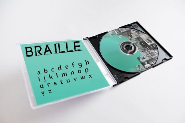
Although this may be a bad idea as I’m leaving it a little late but when I was in the lesson researching a little more about it, my teacher was asking if I needed any help and I wanted to explain my issue. But it actually helped me because he said that my idea was right and was fine I just did not have confidence in it, so I feel like even though I’m about to put more work on myself. Im going to carry on with the Braille and only do the letters; A,B,E,I,L,R to spell out the word BRAILLE, but I’m also going to do the whole alphabet with my other idea.