Process

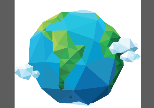
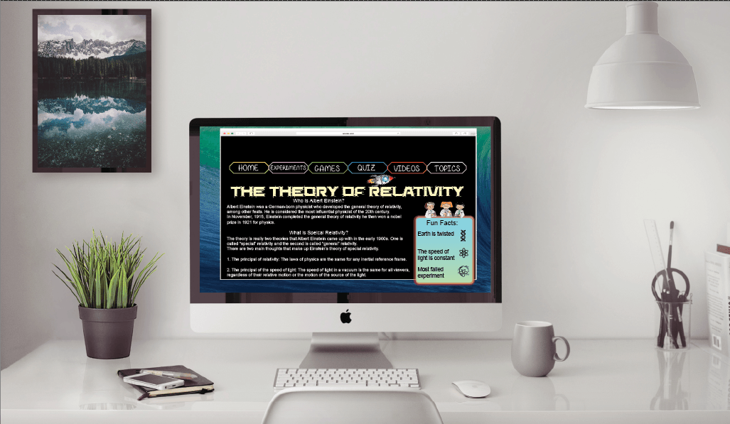
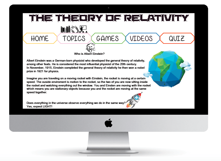
I thought to make it more child friendly I could add little drawings which I got from “Noun Project” and to show which page they are on different but relevant pictures will be above the title. So this the topics page and will have links to different subjects, so this is an example. Because its about Einstein the page I made is obviously based on him, I made the earth picture and added a few little images to interact with the children as well as have information. I was thinking about having a different colour background on this or have an image on it to make it less boring. But Im still playing around and will see how things go, the page may end up changing lots more but not sure yet.

Screen Shot 2015-11-18 at 02.20.07


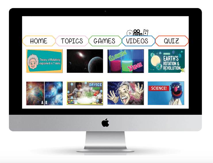
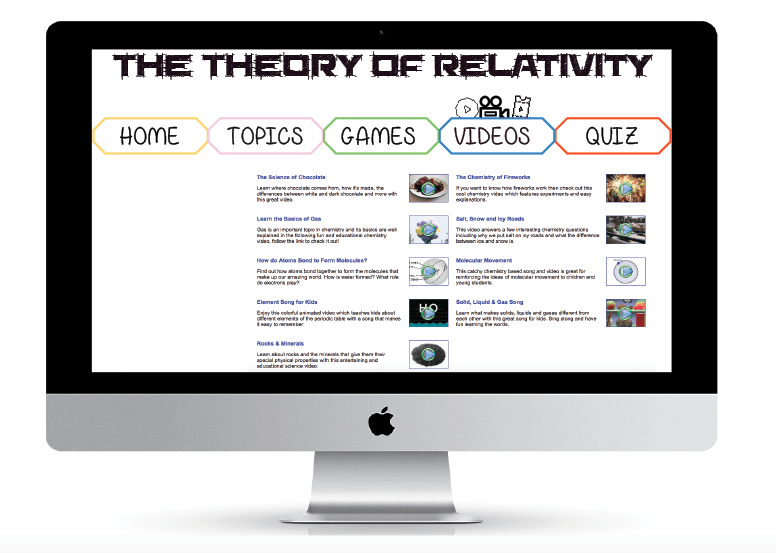
I’m not sure whether to use a background on the video page, because all the pages at the moment are just blank and feel that because like I mentioned before about children liking colour. I feel like I should have something that stands out and makes it more fun to look at.

Screen Shot 2015-11-18 at 02.58.08Screen Shot 2015-11-18 at 02.59.47


Origami Earth

I found this picture of earth which had an origami effect to it, I wanted to use it so on illustrator I worked extremely hard and I feel like I may have spent to much time on it and could have used the time more wisely on other parts of the work.

This is my process of my work….

Screen Shot 2015-11-18 at 00.14.00 Screen Shot 2015-11-18 at 01.52.01 Screen Shot 2015-11-18 at 01.52.08


Looking at the picture seems really cool, but for the amount of effort and time I put in seems rather pointless now because of how small the picture is going to be on the website.

Computer Device

When I was in my workshop today, Chris came round and was looking at everyones work because he explained that we have 2 weeks before the presentation week then a week after that to improve any work. So technically we have 3 weeks, which is rather worrying after Chris had looked at my work. I was doing some rough work on some mockup iMac’s and iPhones, to which I knew about the grids I needed to work with. But I didn’t realise I only had 3 weeks and it really got me thinking about starting to actually put my work together.

This is my rough website I was working on….

Screen Shot 2015-11-17 at 22.18.02

After working on my rough for a little while, I spent a lot of time trying to see what children would enjoy on a website. I feel like fun pictures and colour is the main area for children to feel like they will enjoy it a website. When creating the website I didn’t want to have to many words because if they were young and not very good at reading then they will not learn a lot from the website its self.

These are some of the work I have been working on, when the children are on different pages little images will appear above the title of the page it is on. After Chris mentioned a few workshops ago about “Noun Project” I found this could really benefit the website and make the pages more interactive for children.

Screen Shot 2015-11-17 at 22.12.53

Screen Shot 2015-11-17 at 22.13.00 Screen Shot 2015-11-17 at 22.13.05 Screen Shot 2015-11-17 at 22.13.10


Although the pages are pretty empty or have screen shots of other websites layout for example, video and games I liked the layout but will use a similar technique with a little bit of information about the game and add image or video file so children can see a little preview.

Poster Research!

I started to research some more information for the speed of light, I thought about making a infographic chart so its easy to understand and read.

First I googled “speed of light in mph and this came up,

Screen Shot 2015-11-17 at 16.41.13


This seemed like a lot to put on a chart but if I can compare it to other moving objects like for example; jets, trains, runners like Usain Bolt this may be easier to understand.

So from this I started to look more in to fastest trains and the speed these are all the different speeds of all the objects I’m going to use in the chart.

Screen Shot 2015-11-17 at 16.56.57 Screen Shot 2015-11-17 at 16.57.12 Screen Shot 2015-11-17 at 16.57.18 Screen Shot 2015-11-17 at 16.57.26


Screen Shot 2015-11-17 at 16.59.08 Screen Shot 2015-11-17 at 16.59.22

Screen Shot 2015-11-17 at 17.00.04 Screen Shot 2015-11-17 at 17.00.57


I didn’t want to just do vehicles as you many not get a full understanding of it, so adding something like animals and humans which you may see a lot more than a New Horizon Space Craft. In a way I wanted to make it more realistic with the idea of Usain Bolt and a cheetah will be easier to then realise how fast the speed of light and sound is.

This is my chart at the moment….

speed of light

Infographic time!

Screen Shot 2015-11-11 at 01.32.15

So this is what I’ve been working on with my infographic, the image is a graph that I created to tried to make children understand easier. There is a lot of changes that need doing for example I need to cut of the two inner circles to the points they need to be at and add the percentage of all the different examples which are at the side. This is just a rough image of where I am at so far with my second project.

Having an image like this would stand out on the infographic and I thought it may be child friendly, the idea of having a bright coloured graph for children on my infographic was to try and brighten it up a little more.

This week in my workshop Chris was telling us about a website called “Noun Project” its a website where you can download somebodies icons they have created. I found this really interesting because you could type in anything and it would come up with icons that are similar for your search. I was looking for planets and space, so I typed in space and it has so many different icons which are I am able to use. I typed in many different words some examples are; science, Einstein and many more.

I had an idea after placing my rough graph in to my infographic, because the bottom of the infographic is the graph I could divide the previous part which is the rocket and the graph. To have little icons such as planets and everything to do with space, it would be a little odd to just have icons but having a space galaxy image which the opacity will be slightly lower so it fades into the background but it makes it look like a little section.