Hello!!
So this week in my workshop we had a look again at typography, in my first year we had a brief look at typography and when I was told in my workshop the first area we was doing was typography i was rather happy. Last year I enjoyed it but felt that it never actually progressed any further than searching online at different fonts and finding different typo in books, where as in the workshop we got to do something physical!
We was put in groups and told to go find different typography by taking pictures and coming back to the class to make a collage type of picture which seemed exciting.
After the lesson I felt like I should look more into typography again to refresh my mind from last year so I went by the library on my way home and grabbed a few books.
After reading through a few of the books it really helped me with understanding more about typography its self and not just kerning and how ugly comic sans is. Ive learnt more about the technical side of how interesting typography actually is.
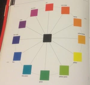
Although reading this seemed like a simple thing that I should already know but its actually rather important. The wheel of colours is conceivable to consist of an infinite number of variations, too subtle for the human eye to discern. The black in the middle of all the colours is mixing together all of the surrounding colours, the black is in fact the root of all the colours. It brings harmony and emotion. – “Colour & Type, Rob Carter”.
Still on the subject with colours and font, colour with font can make a huge difference when trying to express something through words. Such as; red, orange and yellow are colours that suggest warmth. Colours appear hotter as yell decreases and as red increases. When creating something like a poster or leaflet and wanting to put across sad and water a poster would use the colour blue. Meaning blue for water and for the emotion of sadness.
Typography with packaging is key for looking perfect for the shelf, it has to have all the information information about all the ingredients and proper use but the main selling point is the typography on the packaging piece its self. The overall look on the package needs to explain everything about the product but not to create a whole book about it. Simplistic is the key, the colour and typography needs to help the product sell by being bold and creative. Making the product shocking or amazing is a classic rule, because if the product does not seem to have either it will be forgotten in seconds.
Some examples of amazing typography & packaging:


I find these all so simple yet clever, the amazing drawing on the Kraken bottle making it look vintage but still modern, the sandwich has only a few words and is bold but gets the main information across which is enough for a sandwich box. I really like the creative look on the meat boxes, the fact you can see what the meat looks like along with the actual cow or pig on it. This can also make a shopping trip for children fun, to be able to help there parents shop and learn by looking for the cow on the packaging.
Well thats all for today and Im sure I will be back soon!
Thanks again, Shanice!!