Computer Device

When I was in my workshop today, Chris came round and was looking at everyones work because he explained that we have 2 weeks before the presentation week then a week after that to improve any work. So technically we have 3 weeks, which is rather worrying after Chris had looked at my work. I was doing some rough work on some mockup iMac’s and iPhones, to which I knew about the grids I needed to work with. But I didn’t realise I only had 3 weeks and it really got me thinking about starting to actually put my work together.

This is my rough website I was working on….

Screen Shot 2015-11-17 at 22.18.02

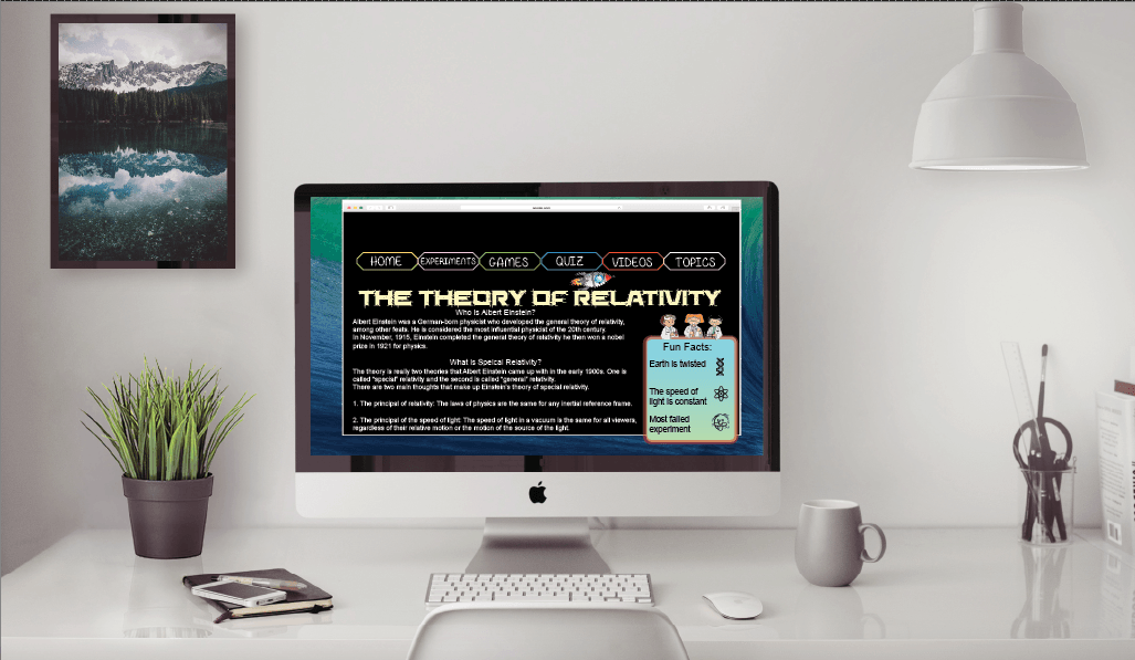
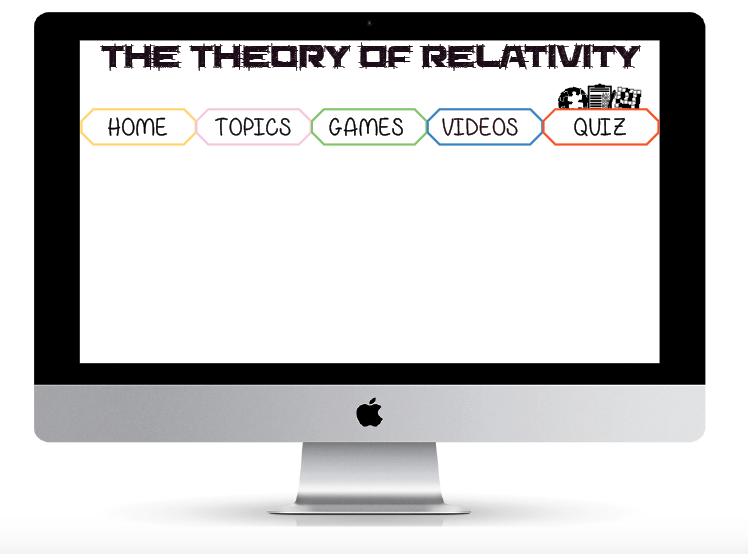
After working on my rough for a little while, I spent a lot of time trying to see what children would enjoy on a website. I feel like fun pictures and colour is the main area for children to feel like they will enjoy it a website. When creating the website I didn’t want to have to many words because if they were young and not very good at reading then they will not learn a lot from the website its self.

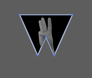
These are some of the work I have been working on, when the children are on different pages little images will appear above the title of the page it is on. After Chris mentioned a few workshops ago about “Noun Project” I found this could really benefit the website and make the pages more interactive for children.

Screen Shot 2015-11-17 at 22.12.53

Screen Shot 2015-11-17 at 22.13.00 Screen Shot 2015-11-17 at 22.13.05 Screen Shot 2015-11-17 at 22.13.10


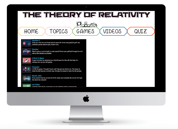
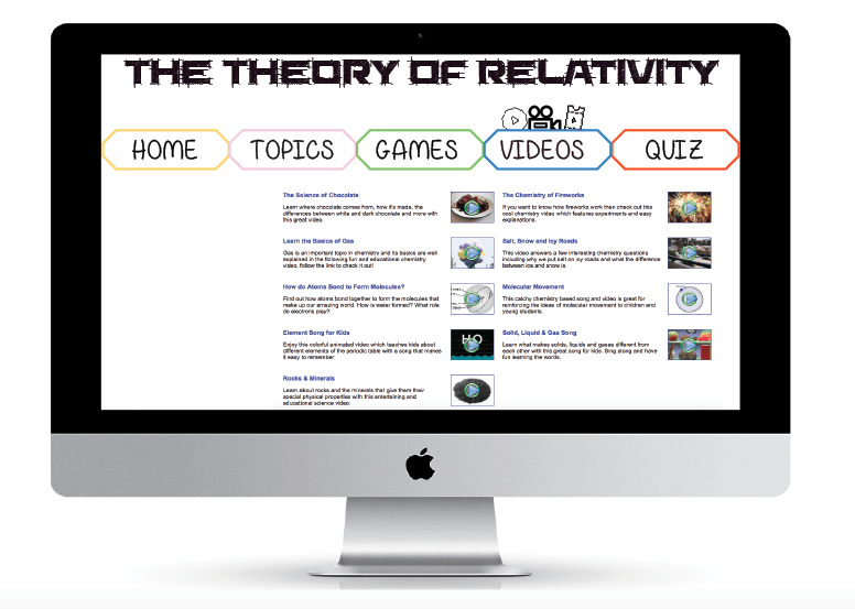
Although the pages are pretty empty or have screen shots of other websites layout for example, video and games I liked the layout but will use a similar technique with a little bit of information about the game and add image or video file so children can see a little preview.

Poster Research!

I started to research some more information for the speed of light, I thought about making a infographic chart so its easy to understand and read.

First I googled “speed of light in mph and this came up,

Screen Shot 2015-11-17 at 16.41.13


This seemed like a lot to put on a chart but if I can compare it to other moving objects like for example; jets, trains, runners like Usain Bolt this may be easier to understand.

So from this I started to look more in to fastest trains and the speed these are all the different speeds of all the objects I’m going to use in the chart.

Screen Shot 2015-11-17 at 16.56.57 Screen Shot 2015-11-17 at 16.57.12 Screen Shot 2015-11-17 at 16.57.18 Screen Shot 2015-11-17 at 16.57.26


Screen Shot 2015-11-17 at 16.59.08 Screen Shot 2015-11-17 at 16.59.22

Screen Shot 2015-11-17 at 17.00.04 Screen Shot 2015-11-17 at 17.00.57


I didn’t want to just do vehicles as you many not get a full understanding of it, so adding something like animals and humans which you may see a lot more than a New Horizon Space Craft. In a way I wanted to make it more realistic with the idea of Usain Bolt and a cheetah will be easier to then realise how fast the speed of light and sound is.

This is my chart at the moment….

speed of light

Infographic time!

Screen Shot 2015-11-11 at 01.32.15

So this is what I’ve been working on with my infographic, the image is a graph that I created to tried to make children understand easier. There is a lot of changes that need doing for example I need to cut of the two inner circles to the points they need to be at and add the percentage of all the different examples which are at the side. This is just a rough image of where I am at so far with my second project.

Having an image like this would stand out on the infographic and I thought it may be child friendly, the idea of having a bright coloured graph for children on my infographic was to try and brighten it up a little more.

This week in my workshop Chris was telling us about a website called “Noun Project” its a website where you can download somebodies icons they have created. I found this really interesting because you could type in anything and it would come up with icons that are similar for your search. I was looking for planets and space, so I typed in space and it has so many different icons which are I am able to use. I typed in many different words some examples are; science, Einstein and many more.

I had an idea after placing my rough graph in to my infographic, because the bottom of the infographic is the graph I could divide the previous part which is the rocket and the graph. To have little icons such as planets and everything to do with space, it would be a little odd to just have icons but having a space galaxy image which the opacity will be slightly lower so it fades into the background but it makes it look like a little section.

Going back to Typography

I have been working on the second project and realised that I wanted to completely finish my typography work so went back to it and started to redo the hands.

I print screened how I did it this time, I had a little problem last time because when cutting out the back ground I took the easy root of using the “Magic Want Tool”. Where as this time I used the pen tool and pointed the parts of the hand singly then used the path tool which cut the background out. Then I edited the hand its self and made sure it was plain and had no wristbands or tattoos, this was the same as I did it last time, then this time to change the colour I simply just used black and white the automatic version and then saved it as a png so it was still transparent.

Screen Shot 2015-11-10 at 16.08.52 Screen Shot 2015-11-10 at 16.10.33 Screen Shot 2015-11-10 at 16.11.03

The second part of how I put the image on to the actual letters, at first I soon realised the letters were still a font and I had to change the font to an outline. That way I was able to have the image inside of the letter which will look professional and what I would like it look like.

Screen Shot 2015-11-10 at 16.17.11 Screen Shot 2015-11-10 at 16.17.39 Screen Shot 2015-11-10 at 16.18.08 Screen Shot 2015-11-10 at 16.18.21 Screen Shot 2015-11-10 at 16.18.29

In more detail to the pictures, firstly like I mentioned I had to make the font an outline, then duplicate the font. I copied the letter then paste in place so it was perfectly inline with the other letter, I then had to make sure the image was in the right place where I would like it to be in the letter. After making sure it was in the correct place, I arranged the image to be at the back of everything and held down cmd and clicked on one of the letters. That way I could then right click and “Make Clipping Mask”, which gave me my final result of my sign language typography.

Up to date!

Screen Shot 2015-11-08 at 22.35.35

So this is my most recent piece of work that I have been working g on and it may not actually seem like I have done a lot but I’ve been looking at small details such as colour for children to enjoy the website its self.

Although I’m currently working on photoshop with this I have been saving the images and parts I want to use for the final piece.