Poster Research!

I started to research some more information for the speed of light, I thought about making a infographic chart so its easy to understand and read.

First I googled “speed of light in mph and this came up,

Screen Shot 2015-11-17 at 16.41.13


This seemed like a lot to put on a chart but if I can compare it to other moving objects like for example; jets, trains, runners like Usain Bolt this may be easier to understand.

So from this I started to look more in to fastest trains and the speed these are all the different speeds of all the objects I’m going to use in the chart.

Screen Shot 2015-11-17 at 16.56.57 Screen Shot 2015-11-17 at 16.57.12 Screen Shot 2015-11-17 at 16.57.18 Screen Shot 2015-11-17 at 16.57.26


Screen Shot 2015-11-17 at 16.59.08 Screen Shot 2015-11-17 at 16.59.22

Screen Shot 2015-11-17 at 17.00.04 Screen Shot 2015-11-17 at 17.00.57


I didn’t want to just do vehicles as you many not get a full understanding of it, so adding something like animals and humans which you may see a lot more than a New Horizon Space Craft. In a way I wanted to make it more realistic with the idea of Usain Bolt and a cheetah will be easier to then realise how fast the speed of light and sound is.

This is my chart at the moment….

speed of light

Infographic time!

Screen Shot 2015-11-11 at 01.32.15

So this is what I’ve been working on with my infographic, the image is a graph that I created to tried to make children understand easier. There is a lot of changes that need doing for example I need to cut of the two inner circles to the points they need to be at and add the percentage of all the different examples which are at the side. This is just a rough image of where I am at so far with my second project.

Having an image like this would stand out on the infographic and I thought it may be child friendly, the idea of having a bright coloured graph for children on my infographic was to try and brighten it up a little more.

This week in my workshop Chris was telling us about a website called “Noun Project” its a website where you can download somebodies icons they have created. I found this really interesting because you could type in anything and it would come up with icons that are similar for your search. I was looking for planets and space, so I typed in space and it has so many different icons which are I am able to use. I typed in many different words some examples are; science, Einstein and many more.

I had an idea after placing my rough graph in to my infographic, because the bottom of the infographic is the graph I could divide the previous part which is the rocket and the graph. To have little icons such as planets and everything to do with space, it would be a little odd to just have icons but having a space galaxy image which the opacity will be slightly lower so it fades into the background but it makes it look like a little section.

Up to date!

Screen Shot 2015-11-08 at 22.35.35

So this is my most recent piece of work that I have been working g on and it may not actually seem like I have done a lot but I’ve been looking at small details such as colour for children to enjoy the website its self.

Although I’m currently working on photoshop with this I have been saving the images and parts I want to use for the final piece.

Mock ups!

So at first I thought you had to pick one of the following; A2 poster, Mobile Device and Website. I started to create a rough of my infographic for the poster and mentioned it in my last post, but after realising what I had done I started to look in to some mock ups for the other ones I needed to do.

I found a mobile and computer mock up which started like this,

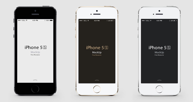
this is what I found online and will use for my final project.

What I will be putting on the mock ups though, I’m not one hundred percent sure yet.

I started to think about what I was going to put on the computer mock up, I was not sure whether to just make a website on there, obviously a child style website with all the bits like the website. But rather than trying to create my own safari I thought as I’m using a mock up already may as well take advantage of it. So I placed a safari website on the computer.

Screen Shot 2015-11-04 at 16.29.36


I just changed it a little like took the words out and made the website black to make it look more like a science website, then I started to add a logo and a menu bar which started to look more like a website. The challenging part I then found was how to make sure I show the website is for children, educational, entertaining and show its about the theory of relativity.

So far this is what I have created with just a little play around and is something rough,

Screen Shot 2015-11-04 at 16.32.39


Screen Shot 2015-11-04 at 16.33.46

Screen Shot 2015-11-04 at 16.34.31


For my mac website mock up, I was looking online for websites that are educational, fun and for children. I found websites such as; http://www.sciencekids.co.nz and http://climatekids.nasa.gov both website was full of images and colour. On climate kids there was a little gif butterfly flying across the screen, I already had a similar idea because I used the idea at college when creating a website and having a gif moving across the screen. So I thought about having a gif such as a rocket which will explain the theory to the children, its fun and can help the children remember.

Second Project!

In my last workshop we was told about our new project we need to work on and then we got to do what we wanted in the rest of the lesson. So most people asked for some help with previous work and then started to look at the new project. Everyone left after about an hour and I stayed till the end to try and get some work done from my first project and to start looking at the new one, Chris helped me when I showed him the hand photoshop drawn image, I was not to sure how to go about it at first. Chris said to draw round the main areas of the hand as it would be a lot easier, the only problem I had with that was I don’t have a steady hand to draw round an image on photoshop. Chris was helpful but I just couldn’t do that option, after he left and everyone else left the workshop I started to do some research for new project.

The new project is an infographic on any target audience that I pick and the tone of content that will be in the infographic. Straight away I knew who I wanted to aim mine towards and used that to start researching some ideas online and on websites such as Pinterest and google.

My target audience is children and for educational purpose, the project is to produce a response to Einstein’s theory of relativity on an infographic. So from reading the brief I started to look at infographics that were already made for Einstein, there was lots of amazing and out the box ideas on infographics. So I started to create an idea for mine,

9d3e80cb2a586a9735d07476909890ae

 386b26fc1e8d118540d030899257538frelativity-how-it-works-150304e-02You need to click on the images to see the457c11cc224ba27e7fb2486aea2063f8 quality and it bigger than it is on my blog, the first image is all about how to not make a bad infographic. Its very interesting and helpful because I’ve not actually ever made one for myself, the first area I came across when reading this infographic is that the colour makes a huge impact on the overall look of an infographic. Knowing that mine is about science Im going to stick to basic colours like black, blue, white and maybe some light colours, the second area is the typography. Of course the size and font is going to have a huge part to play on an infographic because you can’t have a science infographic and the font be really small and fancy because it would not suit the style. Lastly when looking at infographics before in the past I already knew that blank space works for an infographic, so for mine I was thinking about having a space effect and the main colour as black and then a big picture either at the top or bottom of earth, that way I can create blank space without it look weird or bad because the universe has lots of space so it will look normal on an infographic.

Screen Shot 2015-11-01 at 16.12.26

This is my rough idea, the image at the bottom obviously being earth and then having an image on the right and maybe a few more around the page. This is only the first page though, I’m not sure how many pages I will be doing. after looking at the other infographics I found they had a timeline type effect going down the page making it look more effective to have information on it, so I took that in to count and have the line going down with information in-between it all. I need to think about what page will have what information to actually be able to start thinking about the layout of the pages.