Hello!
I had my third workshop and because I missed the previous workshop I felt a little behind with what we was doing in the lesson. But I felt like I had been looking at a few ideas before in the last week of what to do for my project. I did not feel as behind when doing some work.
My main idea at the moment is to work with “braille” and typography, my idea in a nut shell is have a bold type of font and physically add the braille in to the font its self so that blind people can learn what a “B” is with the braille and actually feel the letter of the shape, I feel that this would give them a better understanding of letters and numbers.
I started to look a little more in depth with braille and the history, I needed to know more so that I don’t just make the dots any size because this may actually not work and could cause an issue.
Research!
Braille is a system of touch reading and writing used by a blind person. Embossed dots must be easily discernible to touch and the height of the dots must be sufficient to be easily distinguished from the background.
- The nominal height of braille dots shall be 0.019 inches [0.48 mm] and the normal base diameter of braille dots shall be 0.057 inches [1.44 mm]
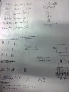
As you can see from my picture above these we’re my ideas and the final one I picked was the braille one, but I did come up with a back idea. The reason I thought to have a back up idea was not because I don’t believe my main idea won’t work or be good, the only negative about it is blind people may not actually be able to read the braille and understand the letters to what they are used to. But I have taken this in to account and my first thought was to have the braille all over the letter like for example, the letter B the braille for b is two dots one above another. I was going to put all the braille in every bottom left hand corner of the letter. The second idea I had was to not have it so big but actually do it the normal size of 0.48 mm and keep it simple like the original braille and not to complicate things more than it already is.
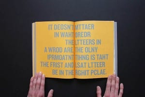
My plan b is do something along the lines of dyslexia and typography, I though as I have a brief understanding being dyslexic myself I could learn more about it for myself and see it works with me and other people. So from this I researched a little more and below are some pictures, I find the left one simply incredible the fact you can have any word messed up and still be able to understand and read it. Just simply have the same letter at the start and end, the middle can be mixed up and it still makes sense. For someone with dyslexia and who struggles to spell it makes sense that you can still read it as the right spelling and word but for anyone else it could be completely wrong.
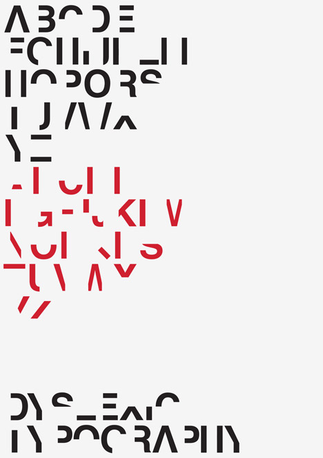
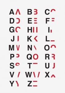
Dyslexia is estimated to affect 10 percent of the worlds population, Dan Britton was in his third year at university when he was diagnosed with dyslexia and he wanted to create a typeface to try and get across to others how infuriating it is to try and read something so simple. The picture below was what he started to create, he took out 40 per cent of each letter and number to remove their key characteristics but wanting to leave enough so they are still just about legible.


