This is the home page for the iPad app and will have very similar pages to the mobile app but the layout will be slightly different, this is because iPads are generally bigger which allows a lot more room.
My Home page for the iPhone app, similar to the iPad but still child friendly and easy to understand.
This is the Videos page on the iPhone, very simple to understand and when clicking on a video the whole screen will show the video.
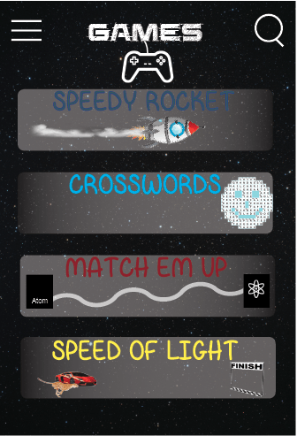
This is the Games page, although it only has 4 games it relates to Albert and children can play and learn at the same time. The layout is very simple but has colour and pictures to get children to like it even more and want to play the games.
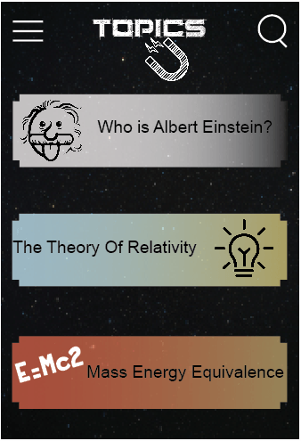
Lastly this is the Topics page, which is the educational side of the app. Ive tried using images and colours again for children being the target audience. When clicking on one of the topics then some information will appear on the page about the specific subject.


