I wanted to leave a post about my inspirations and the artists behind all my work, firstly when I was re discovering typography I already knew some artists that I love and find there work extremely fascinating.

Firstly we have the amazing Ivan Filipov his work is just incredible. I find that it is always so simplistic but has such an impact from what is on the page. One of the first pieces of work I saw of him was “Tricolore Vector Typeface”, the fact I have never thought that several different colours would work with a font and still be able to read what the letter is
 really just looks amazing.
You can see from the picture here on the left hand side that the colours are not even like they are similar so he used them that way, he actually uses different types such as poka dots. This typography really stands out for me and Ivan really inspired me to be able to create anything.

 Another artist is David Mcleod is an Australian multi disciplinary illustrator and artist, he work is not only inspiring but its beautiful.
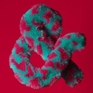
His website is very interactive and professional, http://davidmcleod.com here is the link, one piece of work I like is the “Amfursands” this is the “&” he has recreated it but made them furry and with different types of fur.
All of his work is so simplistic which is what I love because he thinks outside the box. Like how we all would think
of rope when mentioning sailors but don’t ever physically imagine rope typography like he does.
Ivan and David were the two previous typography I already knew about and loved, but after looking at typography again as I mentioned I found artists such as; Chris Labrooy, Thuy Mat Tit and Tomasz Biernat.

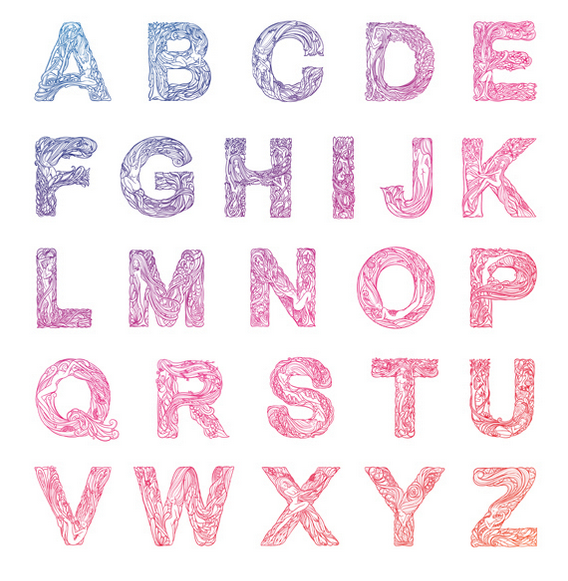
I love Thuy Mat Tit’s “Whispered Garden” work, its truly remarkable, the letters are so minimal but it is containing so much detail inside. You can clearly see the hours and effort that were put into the font. The best letter for me is “Q” the way it just flows on the page the tiny women hiding behind the ivy and flowers and the way that the end of the Q just falls down like Ivy would normally do, just small pieces of detail such as this is so important which is why I love it.
